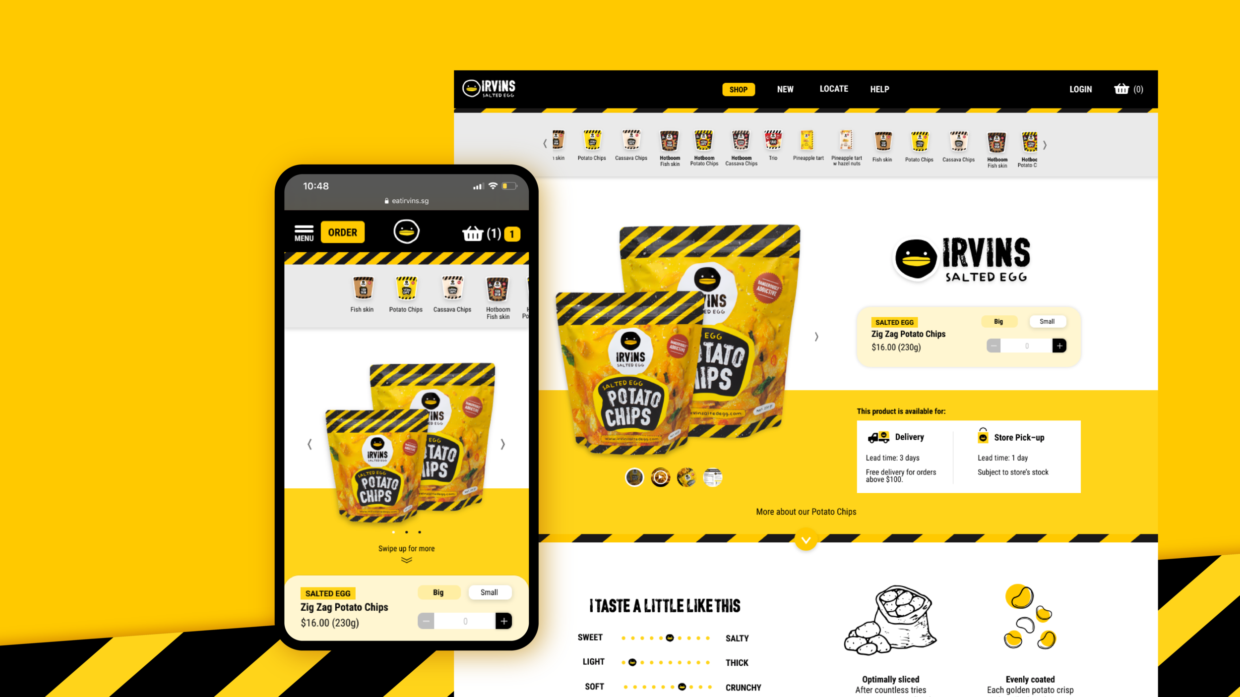
Selling dangerously addictive snacks online.
The design of IRVINS e-commerce site.
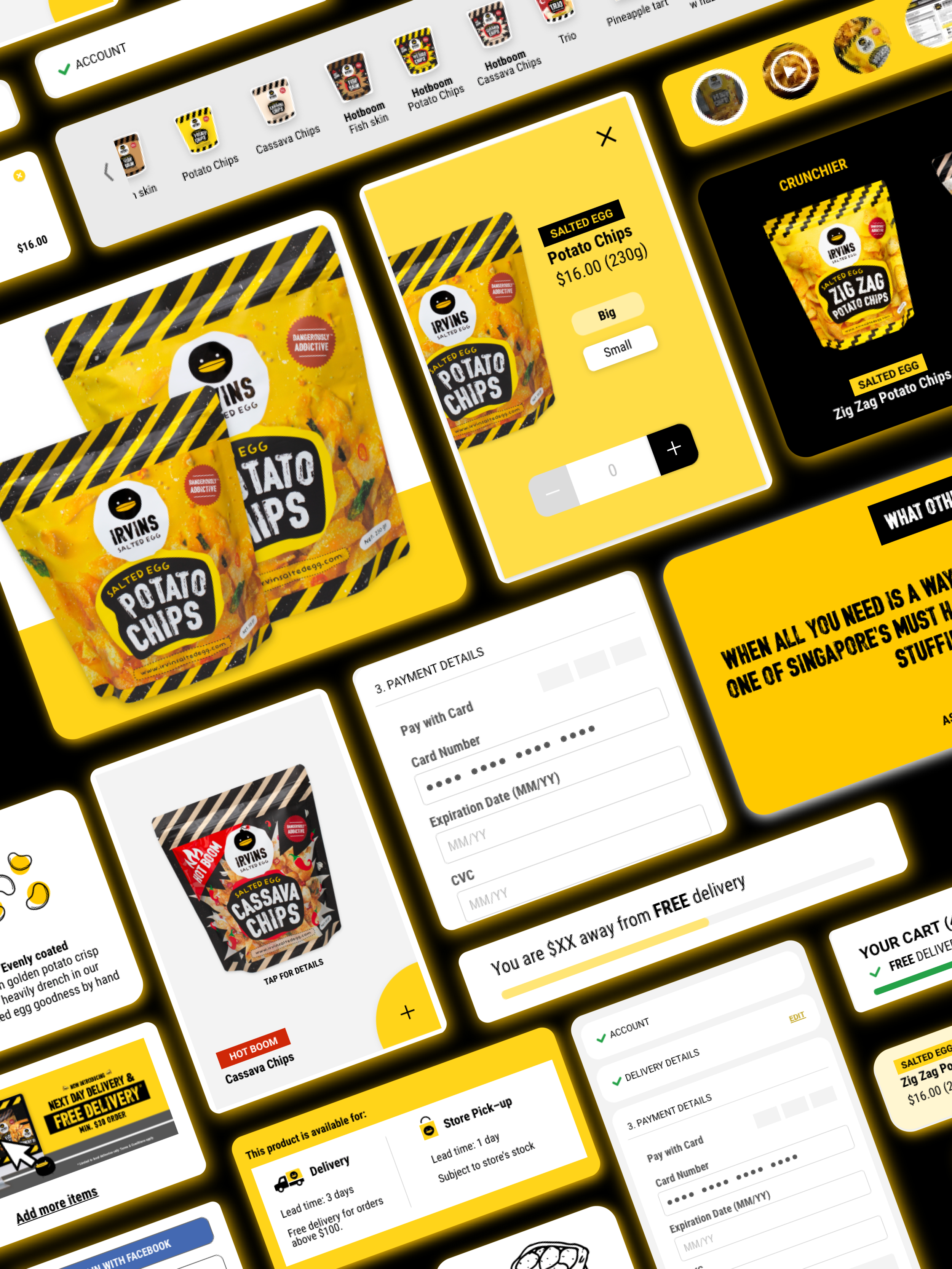
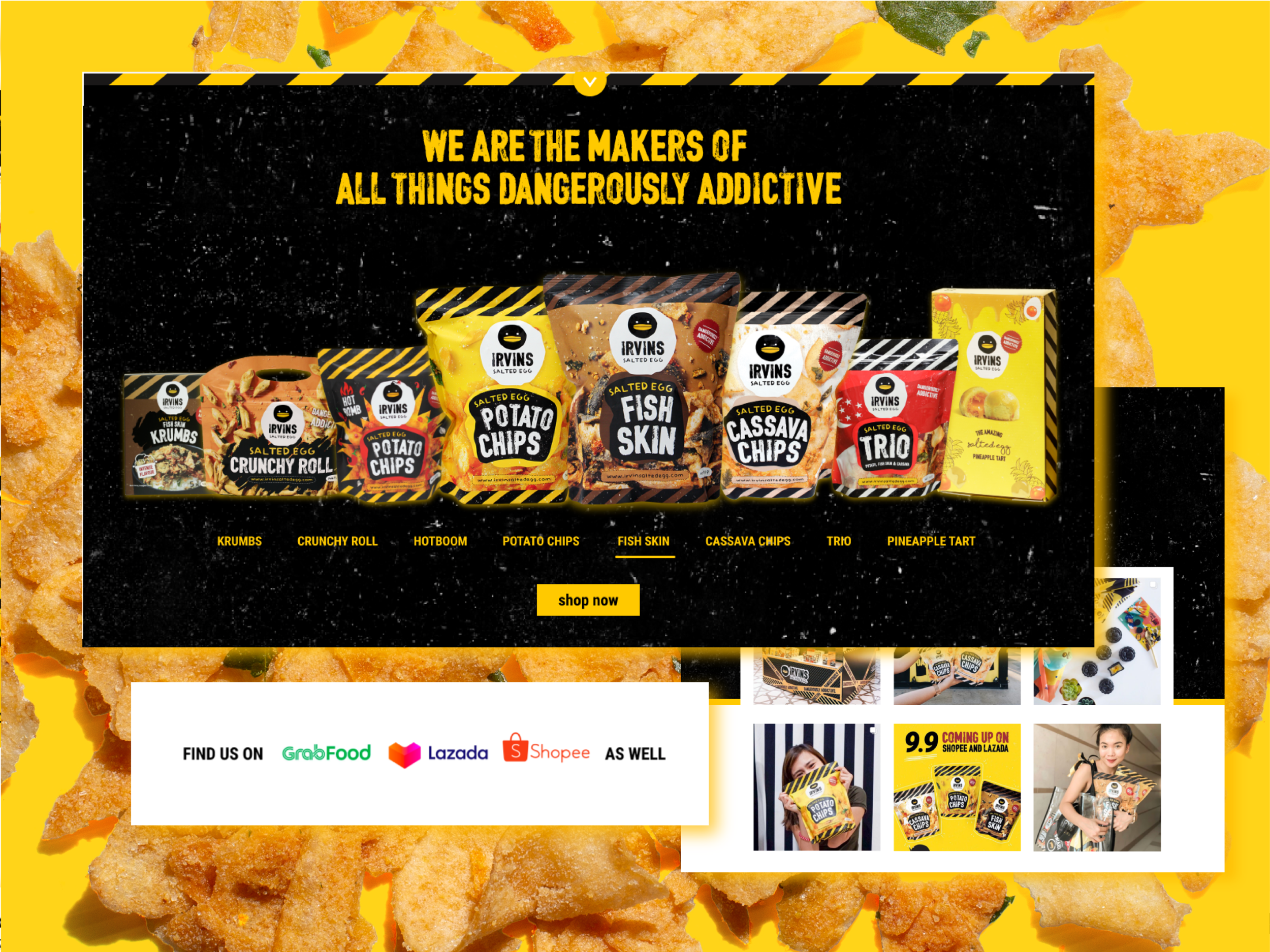
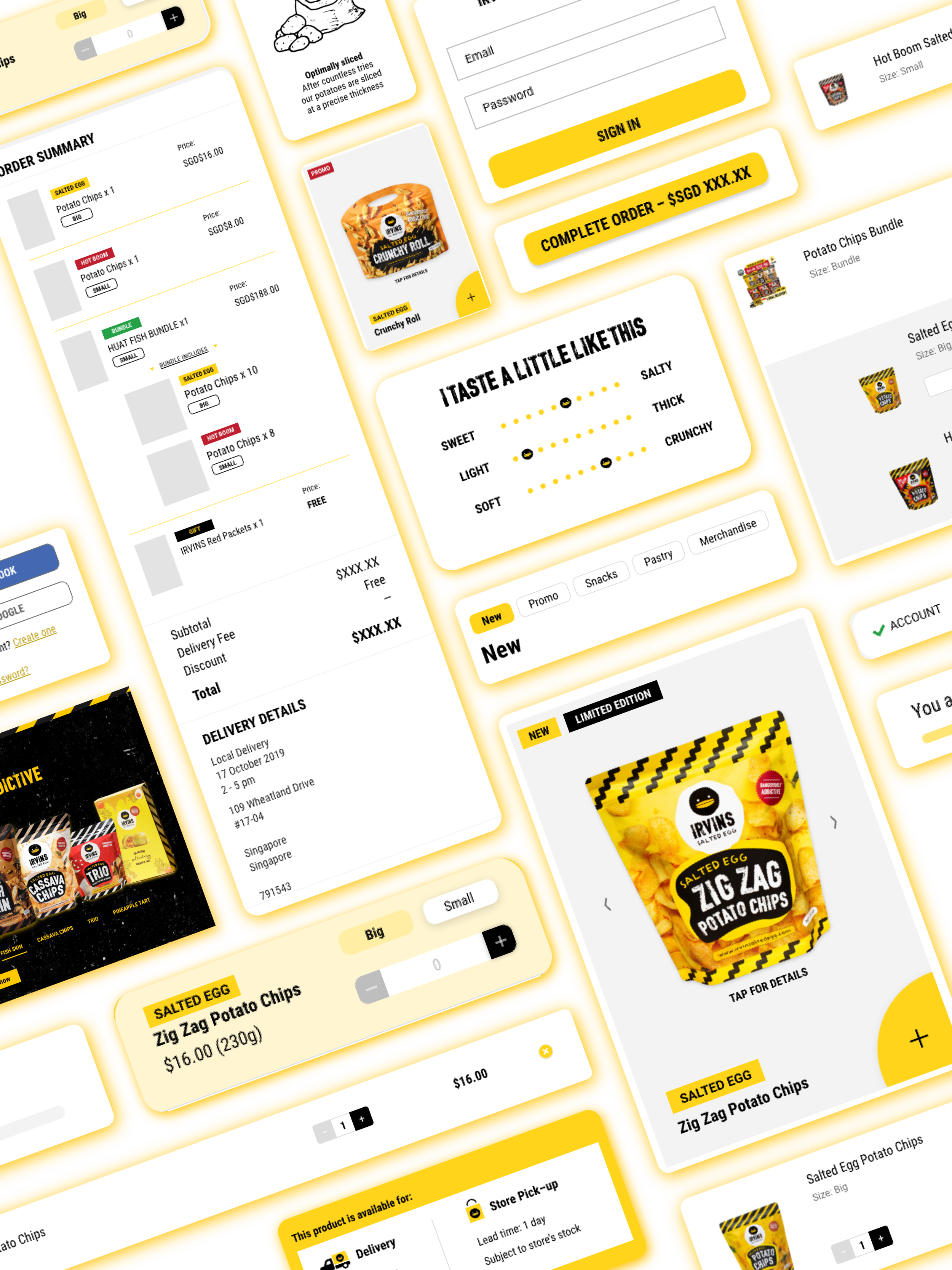
When it comes to salted egg and its craze, IRVINS knows best. Known for being responsible for the snaking queues seen in Singapore’s Orchard road and the infamous yellow paper bags that travellers would carry into the cabin leaving Singapore like a prized possession. Now, what happens when the of selling these dangerously addictive snacks goes digital?
This is where my story begins.
It seemed like a match made in heaven, a designer who lives to eat tasked with creating an online experience for selling these wonderful handcrafted snacks. However, rose-tinted glasses were smashed quickly as I started looking through what I had to work with. The honeymoon was over. It became apparent that the contrast of IRVINS e-commerce stands in stark contrast to its brick and mortar which seemingly had not many issues fulfilling the needs and demands of customers like a well-oiled machine. While on the other hand, the e-commerce site stood there looking like that great and useful water bottle that you bought that could very well help you from keeping healthy to saving some money, but left forgotten in the drawer.
Heuristic evaluation
To help identify key issues that required to be addressed immediately but more importantly to get a sensing of where critical/ fundamental problems may reside, a heuristic evaluation of the site was done as a start. The heuristic evaluation was done in a reverse manner where the aim was to identify red flags and issues concerning the evaluating principle. Meaning, the more points an evaluating principle gets = more issues to be addressed.
Upon the evaluation, the e-commerce site had three main areas that stood out as shortfalls. They were in areas of consistency in standards, aesthetics of minimalist design and error prevention. Along with matches between the system and the real world, though not scoring high in terms of usability issues but due to the lack of, it became apparent that was a missing gap on the site that needed to be bridged.
From bad of font, imagery and visual elements choices were some of the main issues that contributed to inconsistency in standards and shortfall in a clean aesthetics for usability. Another contributing factor was product images that confused users in identifying product sizes. Although the initial design was in some degree aligned with the aesthetics of the brand (grunge and high in visual contrast) when paired the abundant usage of the brand mascot and other illustrated visual elements it created an impression of the site only serving as a marketing site for the user instead of an e-commerce site. Low effort changes were suggested and quickly applied weekly as the research process continued.
Initial low effort changes included homepage revamp with the introduction of elements (CTA buttons, banner space, headers) that suggest the site to be an online store. Along with other quick remedies that helped address the consistency, aesthetics and error prevention shortfalls.
Low effort changes
Opening the packet
As part of establishing the base knowledge of where the site stood against the brand’s competitors, an examination and analysis of the sites of direct competitors(other novelty snack brands), indirect competitors (online grocers) as well as similar brands in the food & beverage industry was done. The collated information showed that IRVINS lacked several key components in its e-commerce site like product description pages, product suggestions, reviews, real estate for marketing banners, abandon cart prompts, feedback for basket size incentives, loyalty/ user accounts programmes and pages dedicated for brand/ product/ education and campaign purposes. Which are all key in shaping the users' decision in purchasing on the site but also in creating a cycle post-purchase, cycling new and returning customers back to the site.
The double-edged sword
Fortunately, what made IRVINS’ site stand out amongst the rest was the option of reservation that is made available to the users. However, like a double-edged sword, it was one of the key issues that are hindering the effectiveness of the site in becoming the efficient revenue channel as it created a user flow that was starkly different from others. Initially created as a preventive aid during the peak sales period, the reservation feature was created to allow customers to have ease of mind in securing products that they can easily pay and collect. While at the same time helping retail staff in lowering the need for service recovery for unhappy customers. Unfortunately, to manage stock levels and over-ordering, users are limited to the amount that they can add to the cart.
Along with other tech complexities, the user flow was set to fit the reservation option within the site. This meant that potential incentives like free delivery might not have been that effective as users would only realise that after adding everything to the cart. Furthermore, processing huge payments also meant a potential to receive lower profit when compared to making a sale via online checkout due to mall commissions on top of card payment services. A redesign of the user flow and site’s architecture was the goal.
Essentially, the e-commerce site had to bridge the gap of the physical experiences into digital experiences that helps users in their decision to purchase as much as possible while allowing all customers to shop seamlessly and with autonomy through various entry points into the site.
New user flow
A new user flow was created that anchored on three phases in the order of discovery, acquisition and conversion while making allowance for other features that can help strengthen pre and post-purchase experiences. This also opened up greater flexibility for marketing efforts where users can be directed straight into a product page while still having the autonomy to navigate around the site and without needing to commit to a purchase method.
Into the real world
To understand and discover the physical experiences that could be bridged digitally, I decided that there was no better way than to experience it myself. Taking a week away from the office, I planted myself in different stores for a week staying a full day at each store. This was to observe and experience what it was like to be both a customer and a seller. After consolidating my observations it became clear that some of the previously observed missing features that other competitors had on their sites were not unfounded but are essentially digital bridges for physical experience.
Translation
The key observations were translated and drafted in the proposed redesign of the site for implementation.
In the aspect of a cross and up-selling, we see banner allocations, product reviews, product suggestion/ recommendation prompts and product-specific pages that included product write-ups that we inspired by the interactions that customers have with the retail team as well as physicals collaterals in the store.
Similarly appropriate feedback for basket size that prompted incentives mirrored retail staff telling customers how much is due while prompting customers to round their spendings up – which strangely enough works on a lot of people.
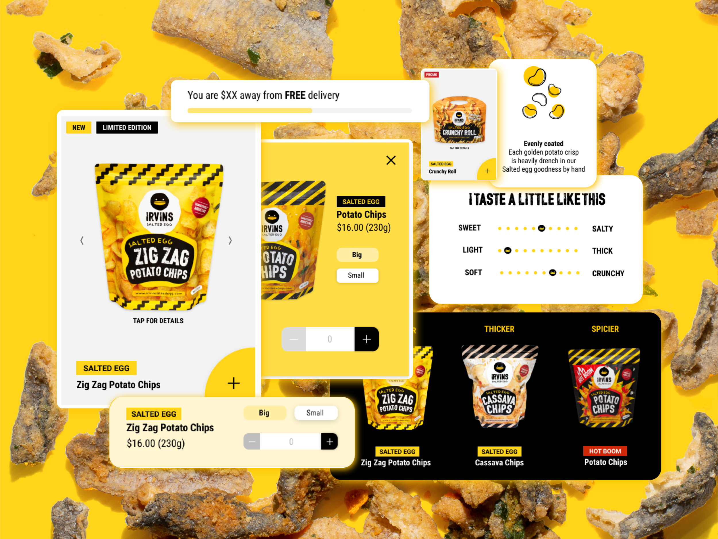
A sticky heard that showcased the range of the products was done to mirror physical store shelving where ease of visibility helps in creating interest for purchase. More importantly, a key aspect that required mirroring was sampling and tangible sensory interactions with products. This was replicated in the form of a sensory taste chart as well as an improved range of product images that helped users to gauge the taste, texture, smell and scale of products.
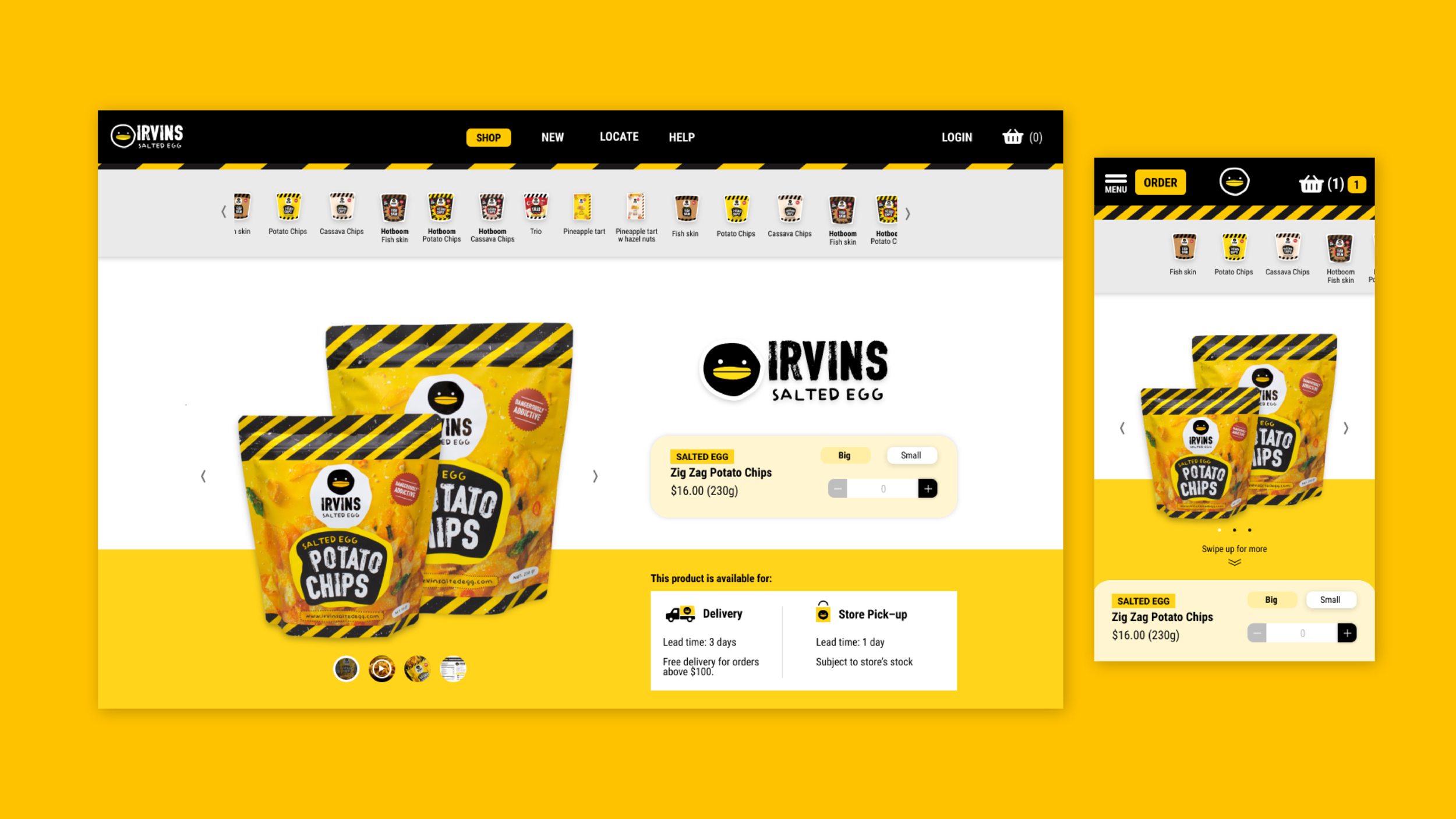
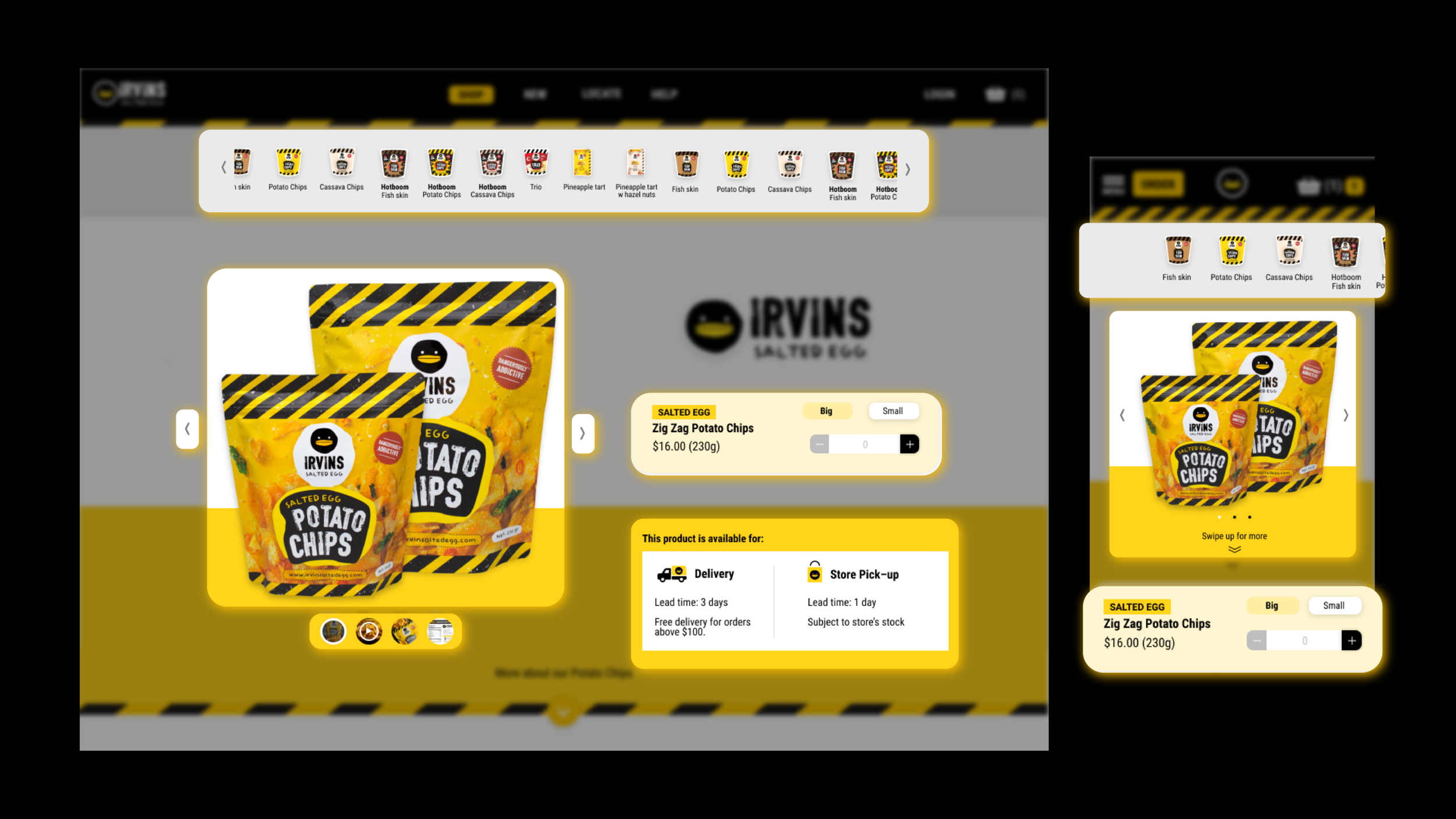
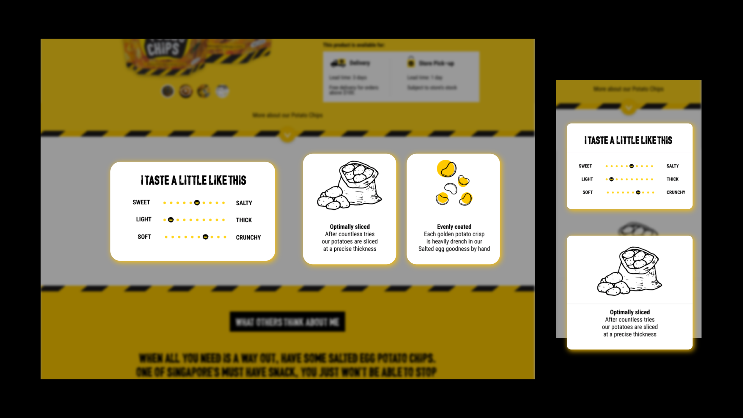
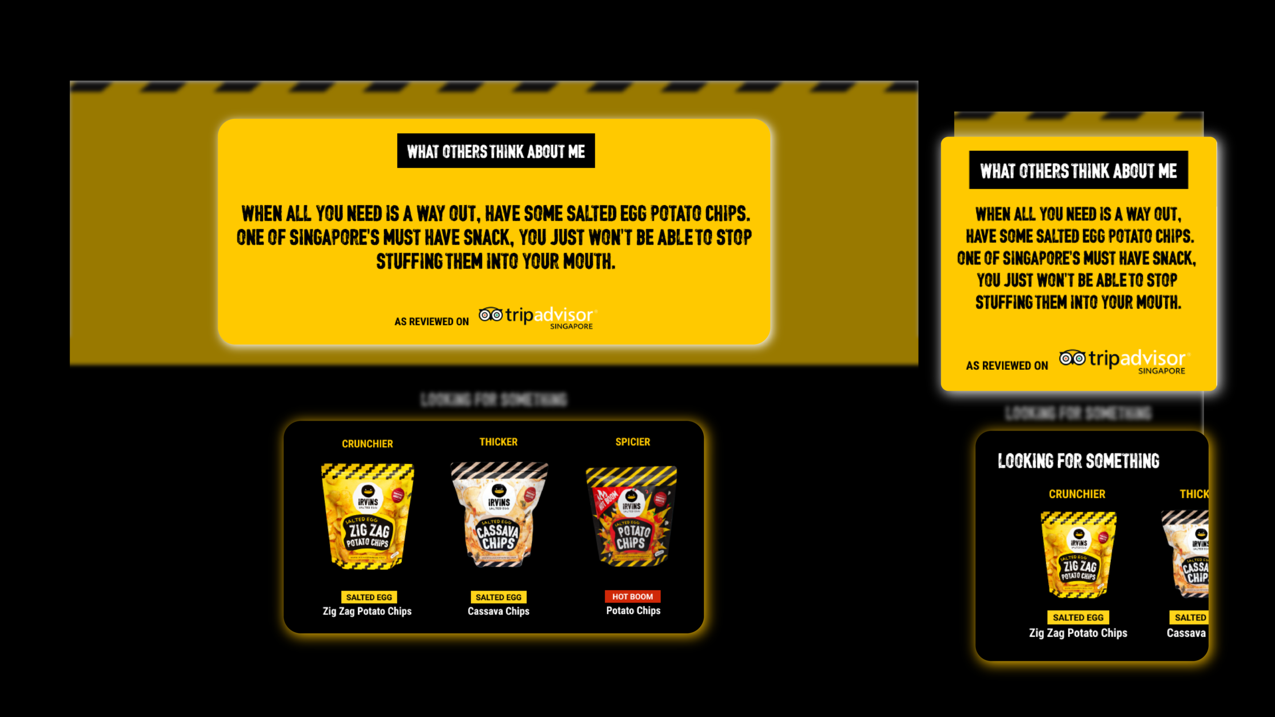
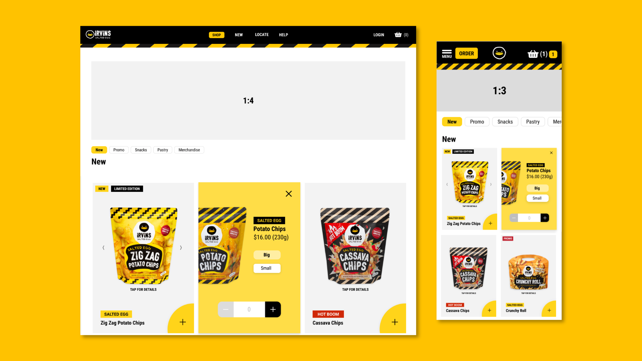
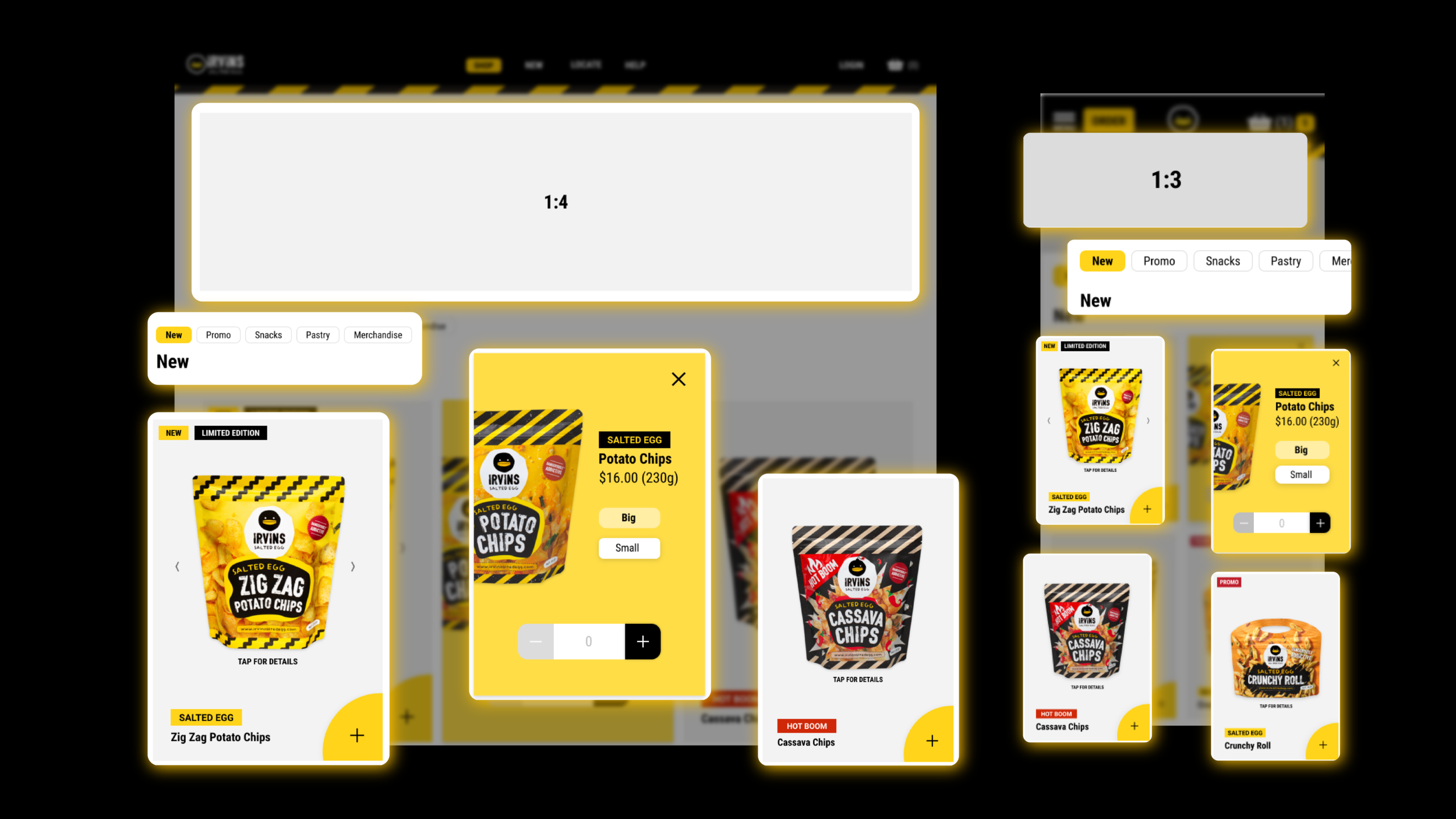
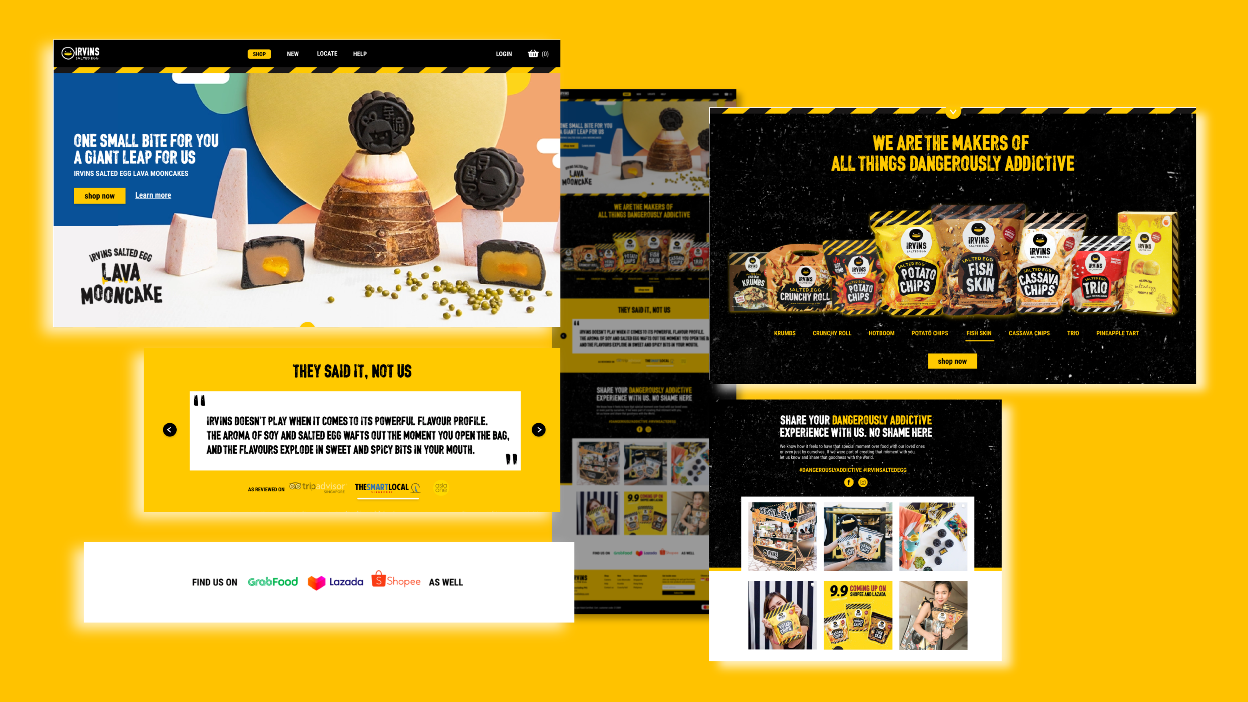
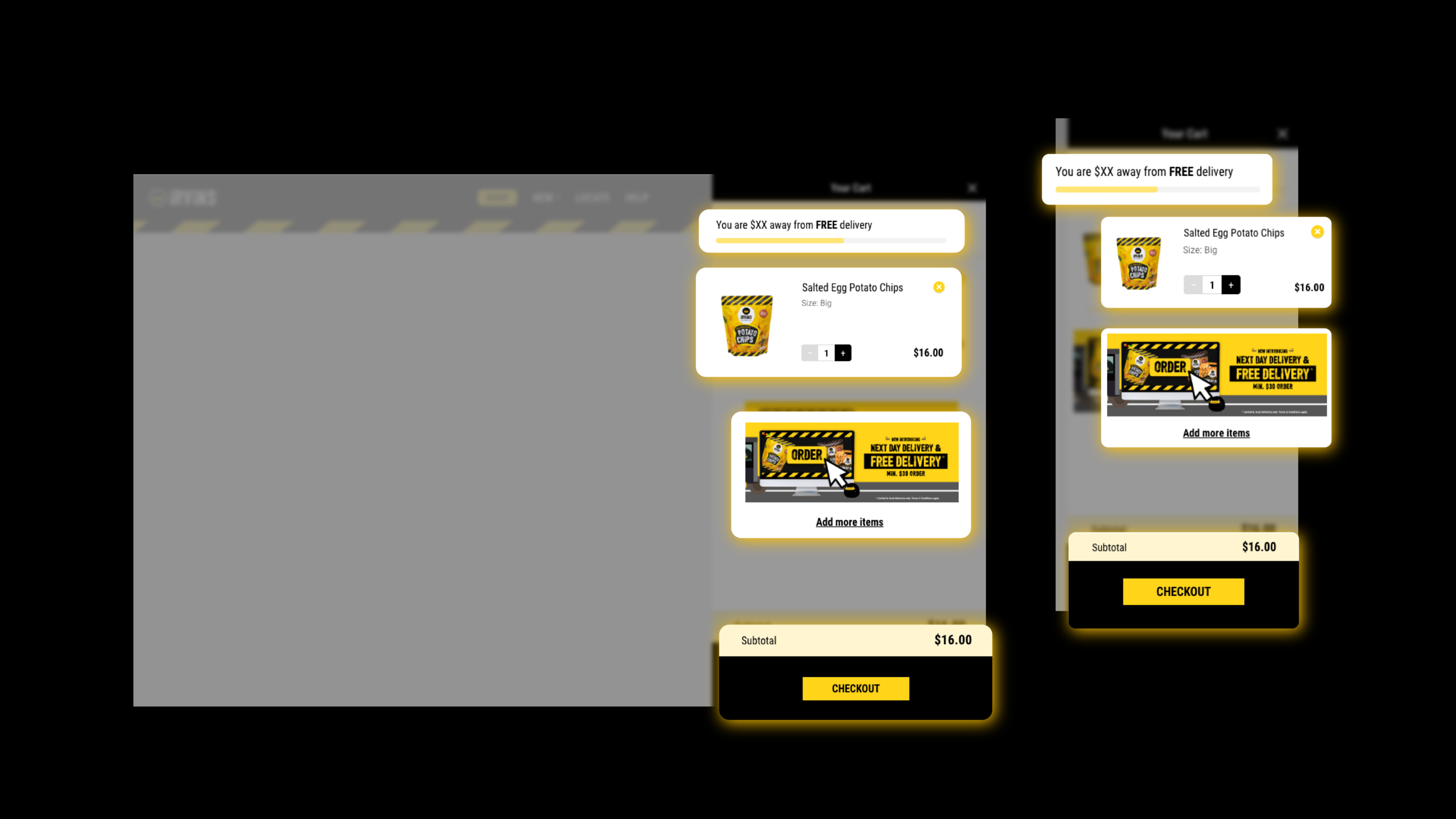
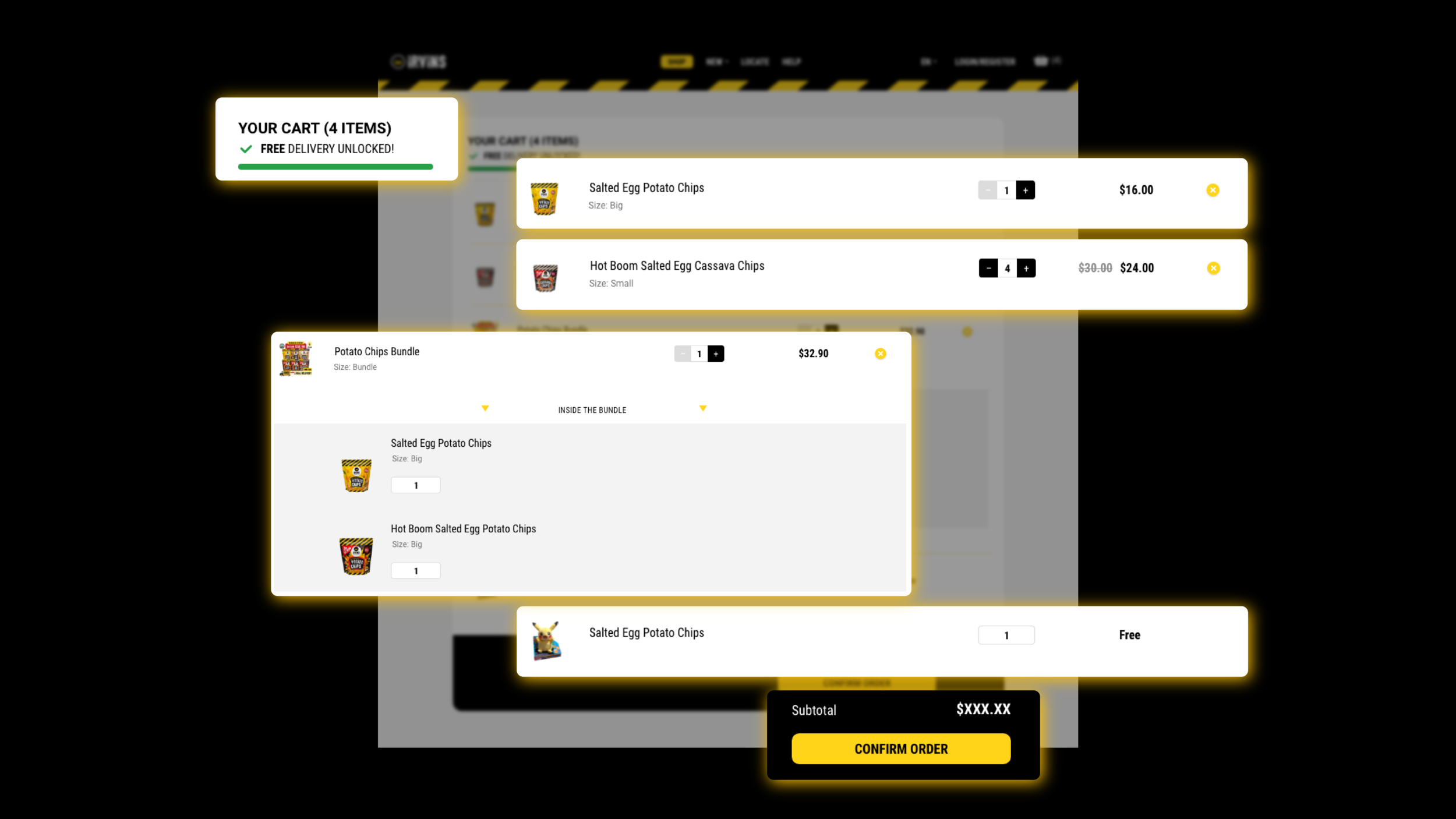
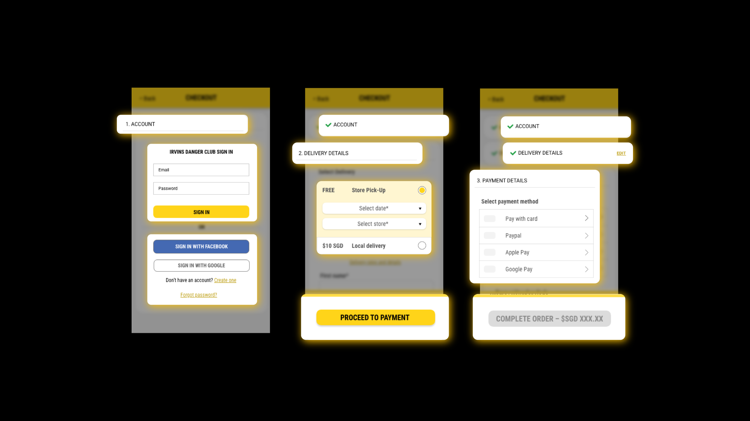
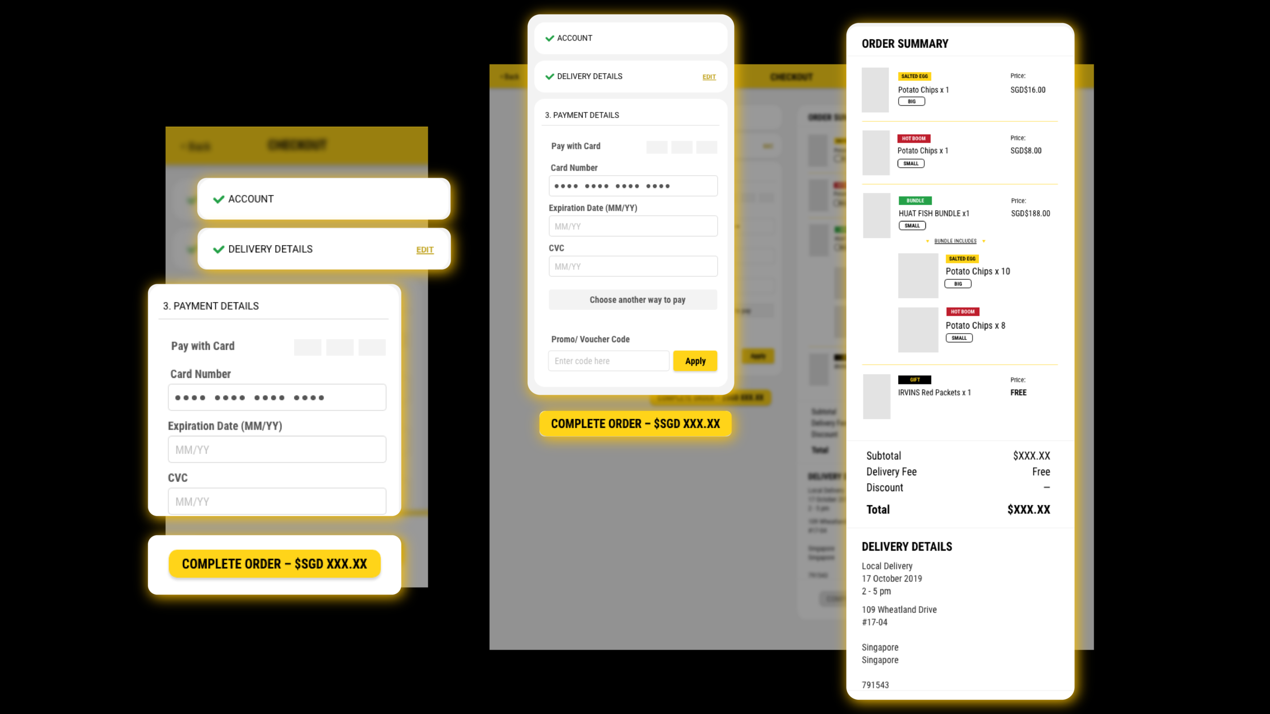
In reality.
We don’t always get
what we want in life.
Rightly so, sometimes we can’t always get what we work and ask for. Unfortunately due to the constraints on resources like manpower and time while still meeting the demanding needs of the digitalisation of a business while pandemic is going on, had us keeping what was drafted and proposed in the drawer.
Due to the needs of the business and urgency to deploy safe and efficiently, while working with the resource of only one designer and a single web developer, a ready template was instead chosen for use but of course, making sure that principle features that were planned for were still included in a simpler or lower-level form. The site has since been revised again by another individual.


