Go to school, don’t play a fool
A retrospective on the redesign of a University website’s information architecture.
When I thought I was done with school
Never have I fully comprehended how notorious University websites are for their information architecture until now. I knew they were far from the great libraries that you could find in these institutions in terms of structure and categorization. However, in reality, navigating through these sites could make one feel like you’re looking for a turtle in a school of sardines
Our ball of yarn
The NUS Business school website was the ball of yarn we were tasked to untangle within two weeks. As such we firstly decided on our 4 research pillars; business & competitor analysis, heuristic evaluation, user testing and elements of User experience. Along with Jesse James Garrett’s methodology as our framework.
Business analysis
Through detailed reads and the opening of various other articles written about the school that we could find, we soon came to an understanding of what NUS Business school is all about.
Experience.
For a business school that has only 53 years under its belt, it sure is some crazy rich 53 years of experience that we have seen here. This relatively young school has certainly made its mark fast on the global stage. With that, it’s certainly is a sign of the quality of students that this institution has been able to produce. As well as the dedication that the school pours onto her students.
This brings us to understand that the NUS Business experience is certainly one that is unique. It is the bridge that the school builds for the students. However, in a day and age where technology is very much involved with education, the school’s website has become a pivotal pillar in shaping the experience of the student’s educational journey.
Competitive Analysis
Upon attaining a better understanding of the school, we placed NUS against two of its competitors (INSEAD & SMU) in a competitive analysis that focused on content accessibility.
The analysis was structured in seeing how each school’s website faired in providing to the needs of three different personas as well as the ease of using the sites.
The three personas are:
John (Key persona)
a working professional looking for courses that could help his professional career.
Mark
a prospective student who’s looking to enrol on a bachelors’ programme
Jessica
a current student who needs to sign up for courses
in summary, we concluded that SMU’s site catered well for the personas of Mark and Jessica. While Insead’s Site catered well for John’s persona. Where does that leave NUS Business school then? Unfortunately, NUS fell short a little when compared to its competitors as finding information on the site was like finding a needle in a hay stack.
Heuristic Evaluation
This brought us to take a deeper look into our heuristic evaluation based upon Jakob Nelson’s 10 usability heuristic for the User Interface Design of the site.
However, we adapted the evaluation to the scoring of red flags in each category, where the higher the score equates to more problems in that particular heuristic. From the evaluation, we could tell that the site suffers from two main areas, inconsistency and flexibility of use.
Getting a bigger picture
After plotting the user flow for the persona John, we plotted out the sitemap of the current site to identify the locations of the content that are relevant for John and how deep they were. Upon finishing the sitemap, it became apparent that a restructure is indeed required.
Card Sorting
To start the restructuring, we conducted a card sort.
We started the card sorting process with an internal sorting amongst ourselves to shortlist the cards that we found were important and to create groupings. After which, we conducted an open sort to validate our assumptions as well as to see if any new categories could be used. With that, we cross-referenced and confirmed groupings that were validated. After which we held a hybrid card sort with users that helped us to gather further data for the categorisation of our information.
Tree Testing
With that, we were able to form up a tree testing with 13 tasks, where we would be able to see if the structured categories for information and navigation made sense to the users.
The results proved positive as only 2 out of the 13 tasks proved to be challenging for users
After analysing the results we were able to identify some of the kinks and fine-tune the structure of our further.
Wire Framing & Usability testing
Working with the information we had, we headed on to work on our sketches and Wire Frames. Which was used as our prototype for usability testing.
Usability Test
Heading straight on with our usability testing, we were pleasantly surprised that out of all 5 tasks our candidates were able to complete 4 on average. While at the same time, the tasks were also completed relatively faster on average.
However, candidates were still unable to complete the task of finding out answers to childcare services. Upon more inquiry, we identified that the problem lied in the naming of the page as well as where it was located.
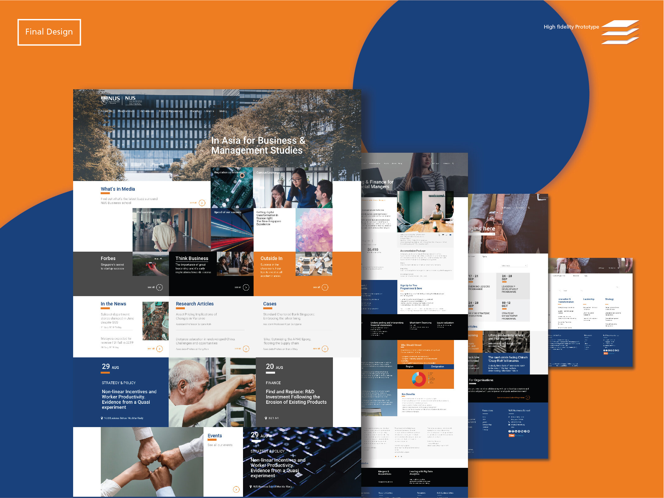
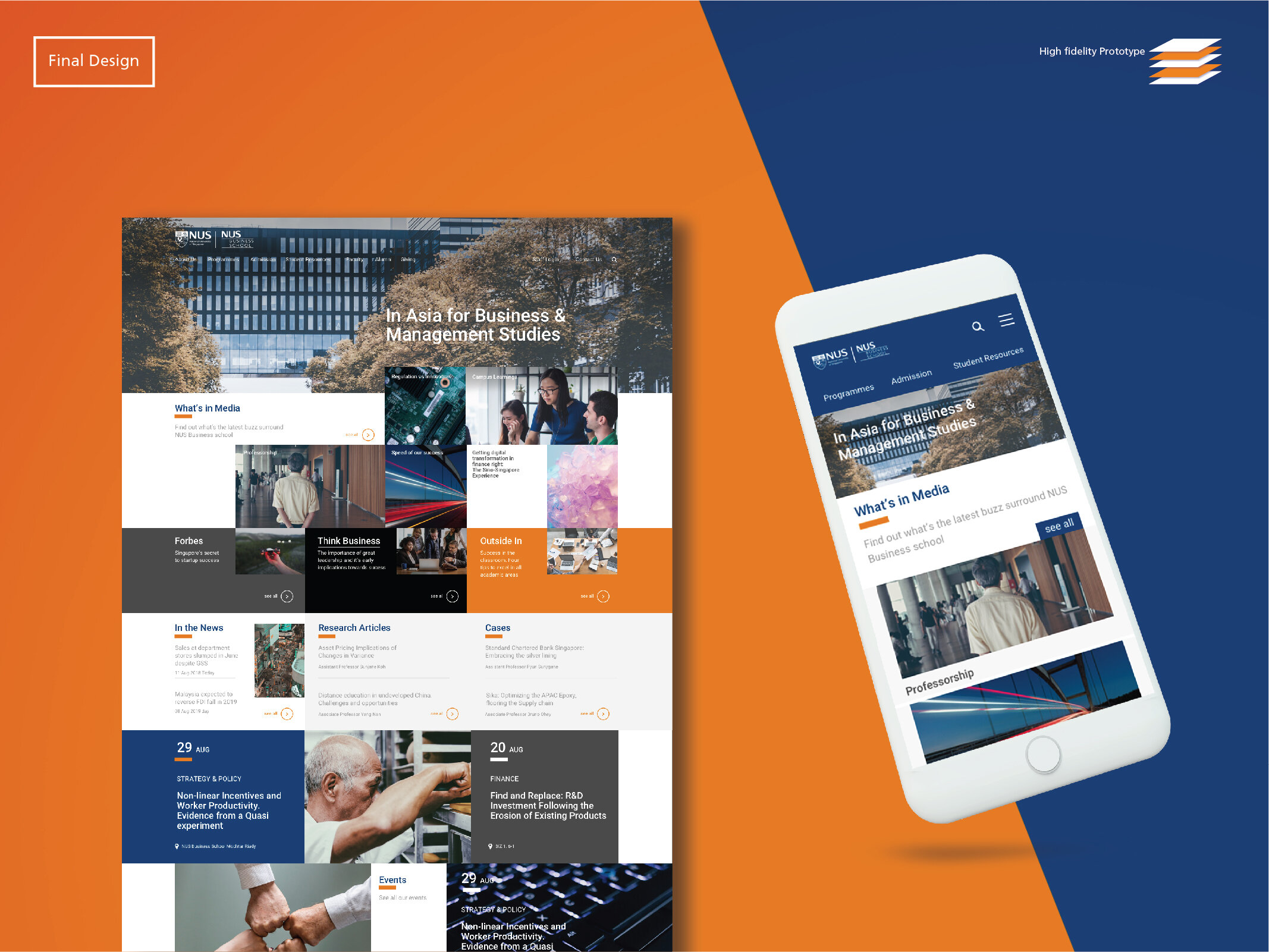
Hence, we decided to rename what was previously known as FAQ to student support services placed under the category of student resources and a new prototype was created based on the new information architecture.


